Example
Philips ‘EncoreAnywhere’ e‑Detail for iPad

Philips
The first e‑Detail app created for Philips Respironics.
Built with my design layouts, it is used by Philips Sleep & Respiratory Care account managers to showcase the remote monitoring capabilities of home-use breathing equipment to healthcare professionals.
E‑detailing digitises sales content and provides it on a mobile device in engaging ways. Presentations are trackable and interaction data is saved for later analysis.
Case Study Philips
Philips Respironics had never before made an e‑Detail Aid so I was in uncharted territory. Clearly, given Philip’s mature brand, I needed to deliver a working design that was obviously ‘Philips’ and looked a natural part of their stable.
Map
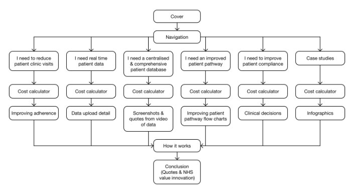
Five possible healthcare professional needs were the starting point for this application, each need providing a route through the material.
Start to finish
Do shoemakers' children have shoes?
Time constraints, non-disclosure agreements, etc., mean that making a record of every stage of a commercial project is impractical. For a more thorough look at a project see how this website (justinwalsh.design) was designed and then updated after user testing.
Come and seeWireframes
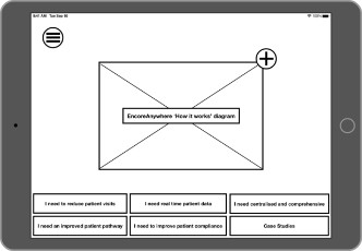
Some of the wireframe images are shown here. Once structure and most of the content has been decided on they are relatively quick to make, simple but effective.
Fail early!
Low fidelity wireframing is fast and cost-effective. Changing course earlier is better and cheaper than doing so later.
Each lower level of wireframing makes subsequent higher fidelity levels faster.
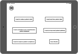
This menu page offers a quick route depending on the need of the healthcare professional. On following pages the menu is fixed at the bottom of the screen.
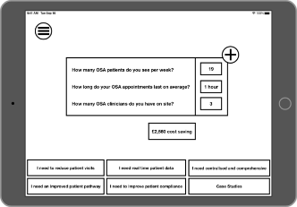
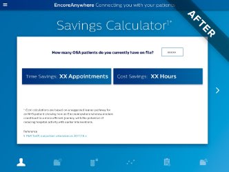
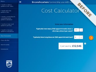
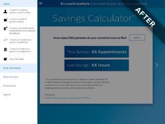
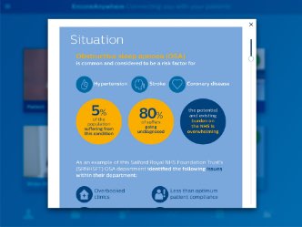
Savings Calculator: a key selling point of Philip’s offering is the overall cost saving per patient, especially within the NHS.
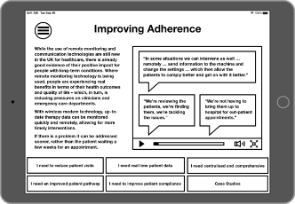
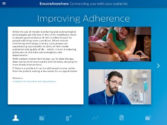
An example healthcare professional need ‘I need to reduce patient visits’ leads to ‘Improving Adherence’.
Following the screens that answer specific healthcare professional needs are screens that are suitable for all.
High fidelity designs
Although Philips Respironics had not commissioned an e‑Detail aid before, Philips do have a strong brand visual vocabulary. Rather than being a constraint it helps with consistency and the time required for the project is significantly reduced because brand designers have already made a great number of stylistic decisions. As the sole UI designer on this project this was very helpful.
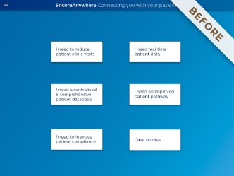
Initially a text-based contents screen was requested but later it was found that a graphical presentation provides a more pleasant user experience.
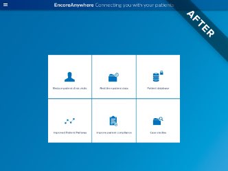

In later iterations, icons of healthcare professional needs became fixed to the bottom of the screen.
It is the Philips Respironics account managers who present this app to the healthcare professionals and so assimilation of the meaning of the icons is not critical to its use in this particular case. The account managers become intimately acquainted with the content and guide the healthcare professionals through.

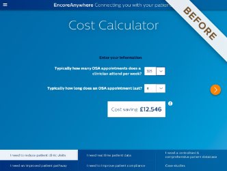
The Cost Calculator not only became the Savings Calculator but it became even simpler. A pop-up modal was removed and its text placed on the page. There is no need to force the user to click on an ‘i’ symbol to read fine print that can easily and unobtrusively fit on the screen.
The drawer navigation menu on the left became brighter and easier to read and used the new icons.
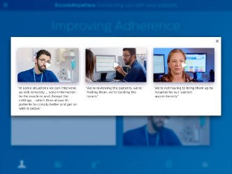
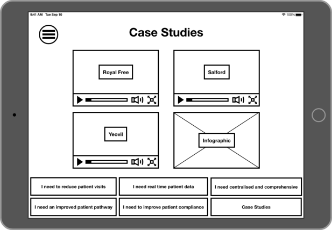
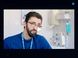
Drilling into levels of content (here providing social proof in the form of user videos) not only encourages engagement but is also tracked. The data can then be analysed, content updated centrally if needed and company representatives can work at an individual tailored level with healthcare professionals.
Philip’s has a library of UI components in Photoshop format but using that programme was slow. For UI layout Photoshop is overly complicated and clunky. In hindsight it would have been very much worth the effort to start from scratch with more suitable tools e.g. Sketch app, Adobe InDesign or Adobe XD.

Justin is a digital designer who really understands web and UX.