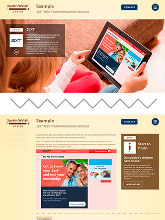
Example
This website

This website
While updating my portfolio I took the opportunity to document its conception, design, user testing and subsequent reshaping and build.
Here I show paper wireframes, low-fidelity wireframes and high-fidelity prototypes and you can also click through to them online.
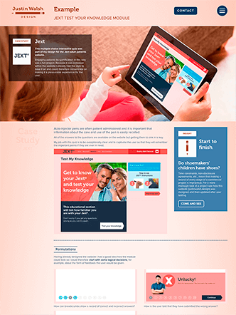
Case Study This site
Overview
My purpose was to make a website that:
- was open to the scrutiny of a panel of testers;
- acts as an online calling card;
- showcases some case studies;
- is easy to use and navigate;
- is not overbearingly design-heavy;
- reconfigures to a variety of screen sizes including phones;
- has a dark mode that mirrors the user's own operating system setting but allows the user to switch modes and for their preference to be preserved between visits;
- allows some feedback sounds if the user allows it (their preference is stored);
- has a short intro animation that plays only once per session and can be skipped;
- deepens my experiential knowledge about implementation to help me to become a better designer.
Facing a blank page it is easy for a designer to draw designs that will put web developers to the test. For my own website I tried not to allow fear to restrain me and instead I resolved to design as I ordinarily would but then to do what it takes to implement the design myself as faithfully to the 'paper' design as possible (and I think I managed that).
My intention to build the site by myself would bring me up-to-date with (for example):
- The latest layout techniques of css grid module and css flexbox.
- Web animation including svg animation.
- Semantic structure.
- Fast page loading and more.
Sections below are:
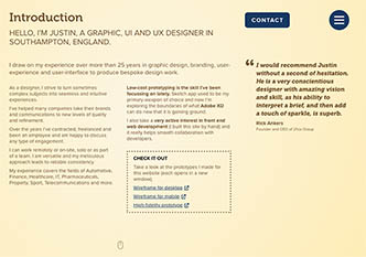
Justin gave us peace of mind: we quickly understood that all of his efforts are well thought out, skilfully executed and the results are powerfully persuasive. I was impressed with his ability to consider, balance and manage business aims, creative concepts and practical considerations. Any business would do well to have Justin on board.
Map
For me it is good practice to make a site map first so that I have a good sense of journeys.
One of the very first questions that came to mind is 'what is more important to the type of person who might hire me?' and so in what order should the pages be?
So I asked my testers about this.
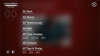
This is the initial page structure and at the time it seemed to me to be a sensible way to start.
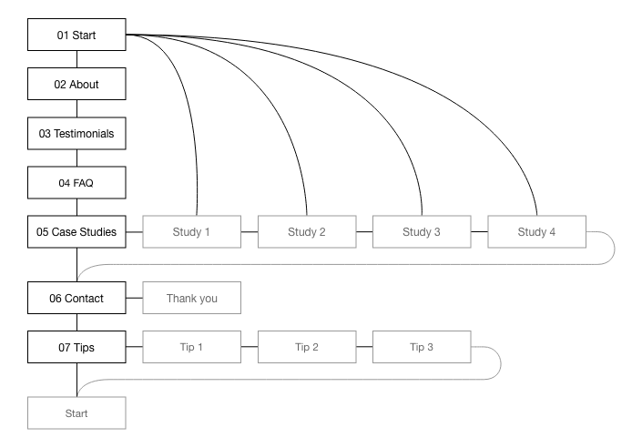
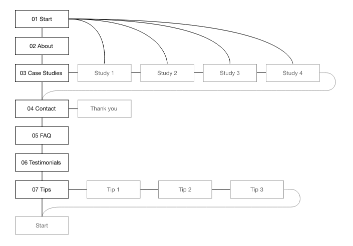
Although the testers agreed that a home page with very visible links to case studies is important, the case studies themselves should not be buried within the site. They remarked that while it is helpful to follow the home page with an about/introduction page (with problems/solutions and what I can do) it must be followed by the crux of the site.
Steps taken:
- Pages were rearranged in the order suggested by testers.
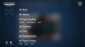
Here is the revised structure.
Paper
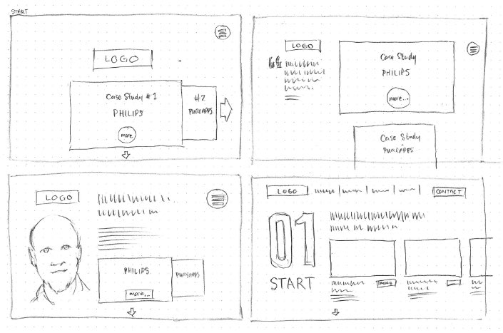
Paper sketch wireframes are the best way to start any design in my opinion.
They are quick and allow for a number of variations of layout. They can even be put online and linked to each other interactively.
More importantly they are a great way to think and analyse without expensive commitment.
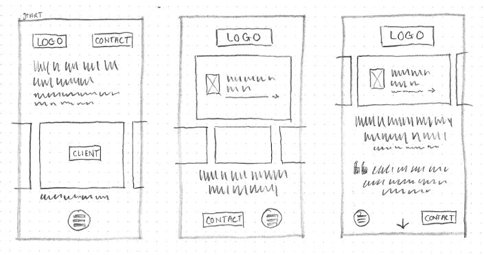
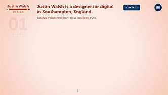
Home page

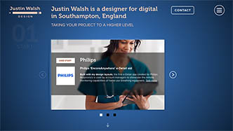
On the home page I thought it important to showcase some work I am proud of.
However, even the Nielsen/Norman Group have mixed opinions about carousels/sliders.
- For some, carousels and sliders are bad practice because many visitors will not investigate any off-screen content;
- For others they are a good way to fit important content on prime real estate i.e. above the fold on a home page.
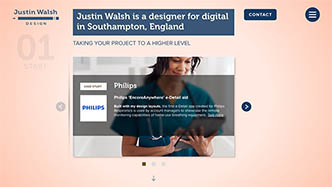
Most visitors to my websites are not casual passers-by – they are interested for work and business reasons. Secondly, I provide a page that shows cards for all of the case studies and it links to each case study's detail page so there is less chance of content going completely unseen.
Lastly, I took Nielsen/Norman Group advice seriously and steeled myself to reduce the number of case studies to only three.
Best value
The least time is spent on paper wireframes but they can give a huge proportion of the result.
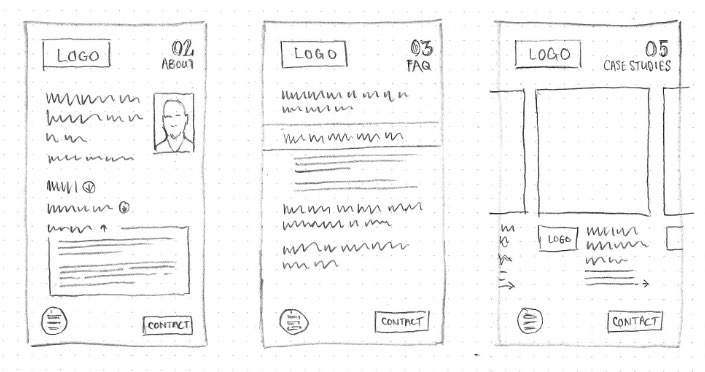
About page
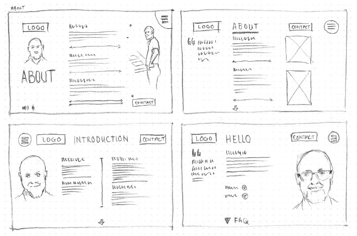
Something I did not know is just how much of my face visitors can cope with. Does a photo of me help or hinder or is it just cringeworthy egotism? More on this question later.
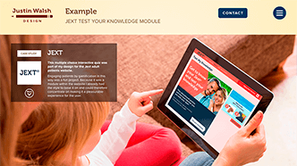
Case study pages
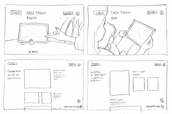
Many designers have the experience of being asked to find such and such an image that depicts a very specific scenario. Most times life just does not work that way. Even with millions of photographs available from photo libraries you’ll seldom be lucky enough to find the exact scene you want – unless you hire your own photographer and models.
In this instance I searched for photos that might fit the bill, and then drew them directly into my paper designs.
Mobile layouts
83% of visitors to my previous website browsed using non-mobile devices.
It is a reasonable assumption that this site should be similar (although I will keep an eye on the statistics over time).
Nevertheless, when building this website I’ve written the code so that it will reconfigure its layout to suit a wide variety of screens. Given the data from its predecessor this website has been designed ‘desktop first’, the designs for mobile devices coming second.
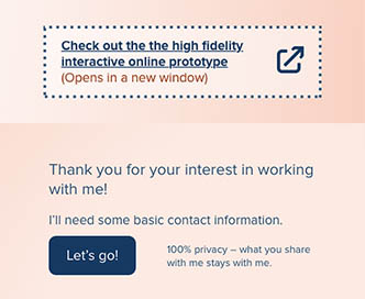
Low fidelity
For the sake of completeness and exercise I did a lot of work on these low-fidelity interactive online prototypes.
They were helpful to articulate the journeys a visitor may take and they also helped to crystallise how the navigation might work, particularly for the mobile version.
However, not every project requires so much formatting detail on every page or indeed making up every single page. Some things can be left for high-fidelity prototypes.
Desktop
Have a look at the low-fidelity interactive online prototype for desktop devices
(Opens in a new window)
Each project is different and requires differing amounts of effort for every part.
On the one hand it makes business sense to do the least amount to achieve the aims. On the other, kicking design decisions down the road can burden developers and content management system editors and they may struggle to fill in the blanks in a way that is faithful to the design.
Consciously or unconsciously the end user may sense that something is strange.

Fat finger trouble
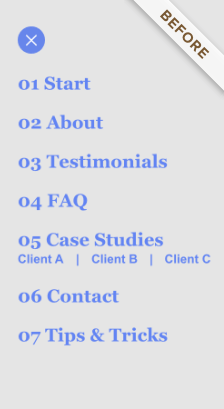

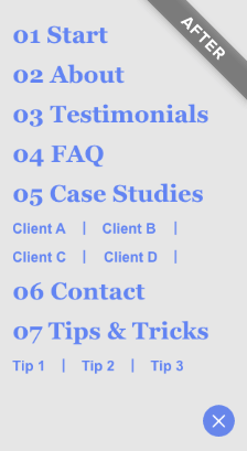
When testing menus on a phone and tablet it became apparent that secondary menu items must have sufficient space to work properly. In version 2 I gave each case study and each tip more generous spacing to accommodate larger fingers (more on this later).
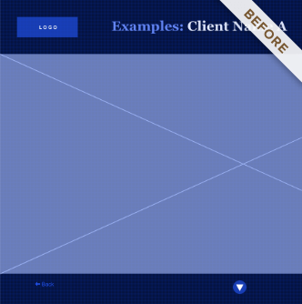
Having a big picture of a product in situ on each case study home page seemed ok but lacked context so in version 2 I added a client logo and a little explanatory text.


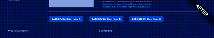
The case studies and tips & tricks pages are the longest by a wide margin. A reader might click the down arrow to jump to the next page or perhaps may appreciate an easy link to a similar page so I added some.
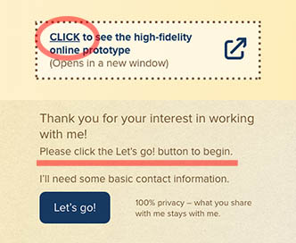
High fidelity
Having sitemaps, paper sketches and/or low-fidelity interactive prototypes can make high-fidelity prototypes more economic because much has been figured out already and therefore fewer iterations are required.
With an agreed page structure, navigation and an idea of outline content, style and brand identity can be tried out, moulded, and finessed and thereafter changed more easily than would be the case if the project had already gone into production.
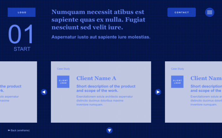
Check out the high-fidelity interactive online prototype
(Opens in a new window)

Testing
Phase 1 of the design of this website was open to evaluation by a group of testers as a high fidelity commentable interactive online prototype.
Here follows a number of the testers' observations that have since informed changes to the site as it now stands (Phase 2).
Colour
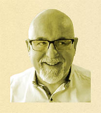
Opinion was a little divided about colours although there was some consensus that the yellow/brown colourway was a little insipid and that tinting of my portrait did not work. One tester pointed out that the logo had a colour not seen elsewhere.
Many commented that they liked the power of the dark mode colourway but some felt the red on the home page was too aggressive.
Steps taken:
- The logo no longer uses an orphaned colour.
- Both light and dark modes now work on a new colourway of salmon and blue and a less saturated blue.
- My portrait is now full colour instead of being tinted yellow (more about this later).

Page order
There were helpful suggestions about the page order. I've written about this above and shown how it affects the site map.
Steps taken:
- Now the pages are in a new order.
- The navigation menu has been updated.
Story context
I had envisaged a one page website that utilises scroll snapping behaviour (and lazy loading of course) and my initial designs had separate 'pages/sections' as introductions to case studies. It became clear from testers' comments that a visitor could jump straight to a case study detail page and miss out on the contextual information given in the introductory page.
In any case, from a technical build standpoint, there is too much content for a single page design to work smoothly on both desktop and mobile.
Steps taken:
- Each case study's introduction and detail pages are combined.
User-skippable content
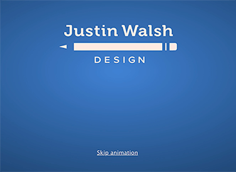
When a visitor arrives at the home page they are presented with a short logo animation. A tester pointed out that the screen was taken over with this and they were presented with no options. Even though the animation plays only once per session the duration was a little indulgent.
Steps taken:
- The duration of the animation was almost halved.
- Now, clicking on the animation or the 'Skip animation' link dismisses it, even if the visitor has disabled javascript in their browser.
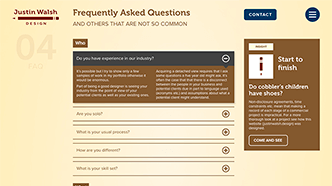
Importance of headline
On the home page the case studies carousel was most prominent but it was pointed out to me that the headline (a crucial detail of the site) could easily be ignored so it had to be made less missable.
Placing a block of colour behind the heading would have been an easy fix but that would have been inconsistent with the rest of the site. Instead, this issue was much improved by changing the timing of the loading of the elements on the home page so that, once the intro animation has finished, the headline loads at the same time as the logo and navigation elements, with a slight delay before the carousel fades in. This happens once only at the start of a browsing session.
Steps taken:
- The timing of loading on the home page (at the start of a session) now shows the heading, followed a little later by the carousel.

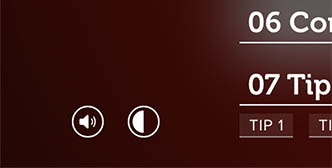
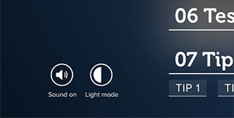
Dark/Light mode
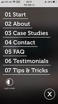
Within the navigation menu there are user settings buttons to toggle Sound and also Light/Dark mode. It was pointed out to me that the function of the Light/Dark mode button is not readily apparent. This is especially true because the button resides in the (full screen) menu so the user might not notice the effect of clicking the button while the menu is open. They might click the button twice, close the menu and see nothing change.
Steps taken:
- Clear textual labels have been added.
Mobile navigation
Testers agreed with what practical implementation proved: on some phones there is very limited space for a menu that shows all options. Phone browsers have notches, address bars and toolbars and the latter two do not hide or shrink on an Apple phone until the user scrolls.
Complicating matters further is that some people have bigger fingers, and some have less agile fingers. It made practical sense to allow more breathing space.
Steps taken:
- Submenus have been removed on menus for phones.

Portrait
The clearest feedback of all was about my portrait that appears on the About page, the Contact page and a Thank You page (for users who have sent me a message using the form).
I had asked testers how they felt about it. On the whole it seems it adds a personal touch but a using a tint of the background colour was disliked. However the strongest opinion was about the eyes which moved to look up at the contact form when the user hovered nearby. Far from being humorous (my intention) it looked spooky.
Steps taken:
- Tinted and moving portraits have now been replaced with full colour photos.


Tone of voice
Following on from the comments about page order it was noted that the prose on the About page it was not very well targeted to any specific audience and that the list of industries I have worked in was sparse.
Steps taken:
- The prose has been sharpened.
- List of industries has been expanded (… and still not a complete list!).
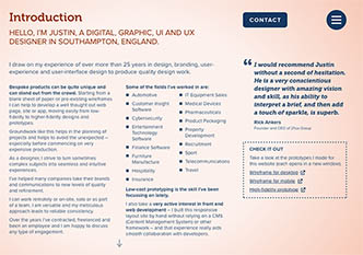
I was told that words such as 'Click here' are "my least favourite things ever". I had not considered well enough how web savvy my particular audience is and that I should not explain (at least in this way) how to interact with a web page.
Steps taken:
- Phrases such as 'Click here' have been removed.
Testimonials
A seemingly throwaway comment made me realise that the testimonials were not linked with any proof of origin.
Steps taken:
- Testimonials now connect to LinkedIn.
Abbreviations
Confusion about acronyms – even though they had been defined earlier – led me to the conclusion that it is better to spell things out (unless all of your visitors happen to be in the same small niche).
Steps taken:
- Acronyms now removed.
Build
There isn’t usually a business case for me to write code for clients; instead I work with specialists who do this every day.
But, all of the code of this website was written by me, by hand and from scratch, with the exception of a few snippets of javascript.
This exercise was a challenge and helped to embed my knowledge more deeply. I have an excellent grasp of up-to-date html, css and sass and it helps a great deal in communicating with developers. They like to work with me because of my understanding of their work and getting my hands dirty makes me an architect who at least knows how to hold a shovel.
Audio – I've added some audio feedback (button hovers and clicks) but for politeness it is off by default. Users can enable it in the navigation menu. The option to toggle it on and off shows in those browsers that are likely to handle it elegantly.
Dark/Light mode – This is becoming the norm in major web apps and it is something I really appreciate as I always have my operating system set to dark mode. My website should pick up the user's operating system preference but they can toggle the mode as they wish by clicking a button in the website's navigation menu and their preference will stick for future visits.
Optimisation – I've made this a fast loading website by, for example, using deferred loading and lazy loading of images, the tiny webp image format, a smart lossy compression png format and also by serving smaller images for mobile.
Miscellaneous I've done a few less visible things like using Open Graph for search engines and social media, spam catching contact forms and I've also obscured contact information from bots and spiders.
Technologies employed
- HTML 5
- BEM methodology
- 7-1 Architecture
- NPM and Node js
- SASS
- CSS animation
- CSS flexbox
- CSS grid
- CSS text columns
- SVG
- SVG animation
- Sound
- Responsive images
- Lazy loading
- Light/dark mode